COMPANY
Eino AI
DATE
8 Bi-Weekly Sprints
ROLE
Lead Product Designer
DATE
Q3, 2022
OVERVIEW
Four months to translate a CLI into a fully designed, enterprise-ready product.
Intuitive enough for daily workflows, transparent enough for engineers who don’t trust black boxes, and polished enough to demo to a carrier where billions in infrastructure spending were at stake.
Background
Nobody signs off on billions in infrastructure spending using a tool that feels like a command line. We had four months to translate raw technical functionality into a fully designed, enterprise-ready product. Intuitive enough to fit into daily planning workflows, transparent enough for engineers who distrust black boxes, and polished enough to hold up in a high-stakes demo to a carrier where the decisions being made were worth billions.
The Problem
To land their first enterprise customer, a major Canadian carrier managing 132+ network sites across the Toronto region, Eino needed to prove that an AI platform could replace the archaic tools capacity planners relied on: disconnected spreadsheets, siloed data terminals, and manual reporting processes that could take months to produce a single report.
The Workflow Gap
Manual Data Wrangling: Capacity planners juggle 4 data scenarios across separate spreadsheets with no integration. Each scenario required manually pulling from different data sources.
No Forecasting Tools: Trigger configuration, threshold setting, and demand forecasting were done by intuition, no models, no automation, no scenario comparison.
Disconnected Tool Chain: Planners spent more time context-switching between tools than actually analyzing data, and every transition was an opportunity to lose critical context.
132+ Sites, Zero Visibility: The mental load of holding the entire network in working memory meant only the most experienced planners could operate effectively.

Solution
How We Solved It
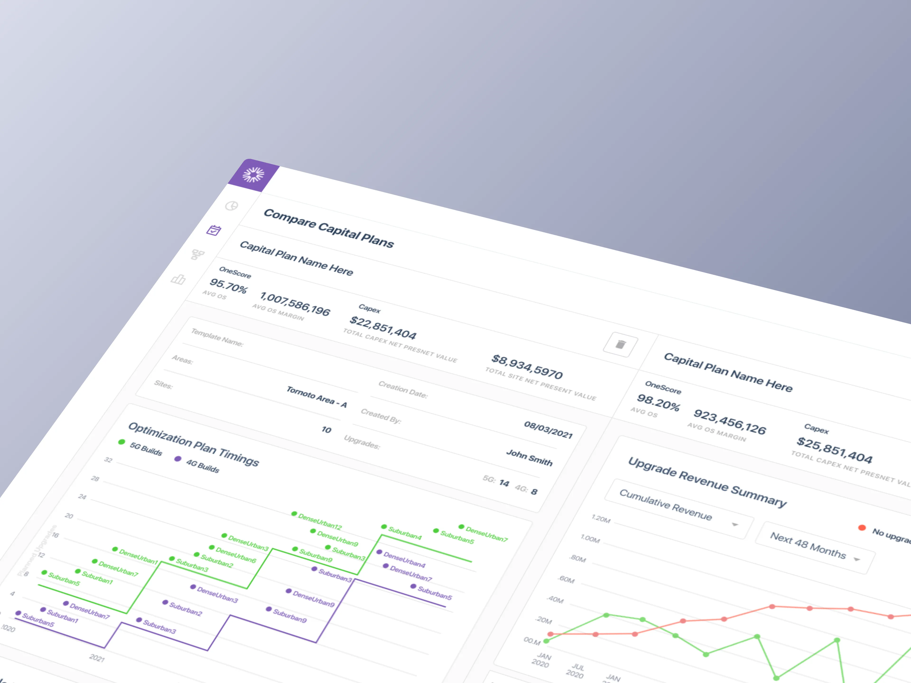
We designed a unified capital planning tool that replaced Bell's disconnected tool chain: spreadsheets, ring diagrams, and siloed data terminals, consolidated into a single application. Capacity planners could model 4 data scenarios, compare sites side-by-side, configure triggers and thresholds, and generate forecasts without context-switching between tools.
The MVP shipped 50+ screens across 6 user journeys, covering the full workflow from template setup through report generation. Every interaction was designed around how planners actually think: site-first, not data-table-first.
Unified Data Layer: 4 data scenarios (Network, Revenue, Cost, Combined) accessible from a single interface instead of separate spreadsheets.
AI-enabled Forecasting: LLM-driven capacity projections replacing tribal knowledge and gut-feel predictions.
Scenario Comparisons: Side-by-side site analysis with configurable triggers and thresholds, eliminating spreadsheet toggling.
Trend Forecasting: Searchable, filterable view across 132+ sites replacing the mental model that lived only in planners' heads.

RESEARCH
Learning a Domain That Had Never Been Designed For. Until Now.
Telecom capital planning runs on spreadsheets, tribal knowledge, and tools built for accountants, not planners. No design patterns existed. No comparable products to reference. The domain had never been approached as a user experience problem. We had to learn the work before we could design for it, which meant embedding with planners, mapping every decision they made, and building a pattern library from scratch.
Discovery by the numbers
3 requirement gathering sessions to help prioritize our backlog for the POC
3 white-boarding sessions to align stakeholders on scope and mental models
12 stakeholders interviewed across 3 weekly rounds
29 user stories written to map a single capital plan end-to-end
49 stories mapped and prioritized across 6 user journeys
Analysis
Insights
3 rounds of interviews with Kevin Abraham Eino Leadership, Eisha Patel (domain expert), and carrier engineers from Bell. The existing tools had been built around data structures, not planner workflows.
Our goal was to understand how capacity planners actually work, not how leadership assumed they worked. Each round surfaced deeper insights: the first established domain vocabulary, the second mapped workflows, and the third pressure-tested edge cases.
What We Learned
Must-haves: Triggers and thresholds are a core decision mechanism and need to be configurable, not hard-coded.
Takeaways: Planners think in sites, not data tables. The entry point must be geographic, not tabular.
Pain-points: Scenario comparison requires toggling between 4 spreadsheets. No way to see them side-by-side.
Deal-Breakers: Carrier engineers don't trust tools that hide the raw data. Transparency into the model is non-negotiable.


Iterations
When Every Pattern Is New, Iteration Is the Only Proof
With no precedent to reference, the design process had to do the work that research couldn't. Four full rounds of iteration, from rough wireframes to production-ready UI, across more than 50 screens. Each round surfaced a new constraint. Each constraint shaped the next decision. The wizard pattern wasn't the obvious answer. It was the surviving one.
How the design evolved, sprint by sprint
Sprint 1: Mapped analyst workflows, identified 20+ hours/week lost to manual data compilation
Sprint 2: Designed a custom data ingestion engine that reduced compilation time from days to minutes
Sprint 3: Rebuilt the report generation system around customizable templates ready for executive presentations
Sprint 4: Redesigned financial visualizations to surface ROI metrics non-technical stakeholders could act on
Sprint 5: Visualized AI recommendation improvement over time to demonstrate the platform's learning capability


50 Screens
Designed across 6 key site planner workflows
6 Steps
Wizard pattern to reduce cognitive load
12 Clicks
To generate a report, reduced from 12 clicks to 5
Final DEsigns
Shipped and Demo-Ready
in Six Sprints
The Final Sprint
As prototypes became components and eventually a design system, iterating in code, we maintained the velocity needed to hit our demo deadline. The carrier POC demo used the implemented MVP, while the clickable prototype continued evolving as the design system became more opinionated.


IMPACT Delivered
Product-Market Fit Validated in 12 Weeks. The MVP That Became
a Platform
Beyond the MVP
The capital planning MVP validated Eino’s product thesis and shipped the proof point needed to close enterprise deals.
A single-feature POC built for one carrier scaled into a full AI-powered network planning platform. Eino expanded into hospitality, education, manufacturing, real estate, sports, and mining, turning a narrow vertical tool into a horizontal platform play.
$5.2M
Secured funding following the Proof of Concept demonstrations
78%
Reduction in report generation times from several days to hours
75%
Decreased manual data compilation hours for 3 of 4 analysts